6 MISTAKES TO AVOID
WHEN DESIGNING FOR PRINT
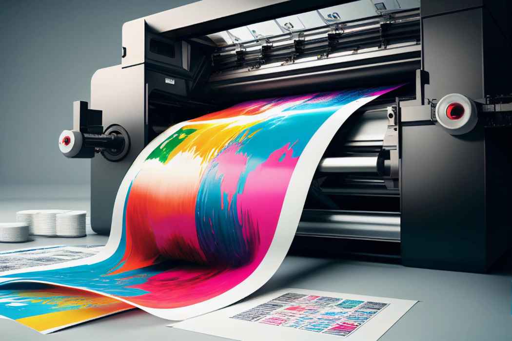
Creating print materials, whether it’s a large banner or a small business card, needs a different strategy compared to designing for digital platforms such as the web or social media. Here are six typical errors printers come across when receiving files for printing, along with suggestions on how to prevent them:
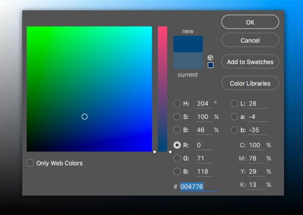
1. COLOR MODE: RGB TO CMYK
When creating digital designs, colors are typically represented using the RGB (Red, Green, Blue) color model. However, printers use the CMYK (Cyan, Magenta, Yellow, Black) color model to produce colors on paper. Therefore, it’s essential to convert RGB files to CMYK before sending them for printing. This conversion ensures that the colors in your design appear as intended on the final printed material. Whether you perform the conversion yourself or rely on the printer to do it, make sure it’s done as the final step in the design process to maintain color accuracy.

2. IMAGE RESOLUTION
Image resolution refers to the number of pixels per inch (ppi) in an image, which affects its clarity and sharpness when printed. For standard printing projects like brochures and business cards, where the viewer will be looking at the material up close, images should have a resolution of 300 ppi to ensure crisp quality. On the other hand, wide format printing, such as banners or posters meant to be viewed from a distance, can use a lower resolution of 150 ppi without sacrificing quality. Using unnecessarily high resolutions can result in larger file sizes and longer processing times without improving the printed quality.
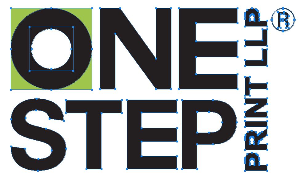
3. CONVERT TO VECTOR ART
Vector graphics are composed of mathematical paths rather than individual pixels, allowing them to be scaled to any size without losing quality. When designing for large format printing, such as signs or banners, it’s recommended to use vector artwork whenever possible. Vector files are particularly useful for logos, illustrations, and text elements, as they ensure sharpness and clarity regardless of the final output size.
4. INCLUDE BLEEDS
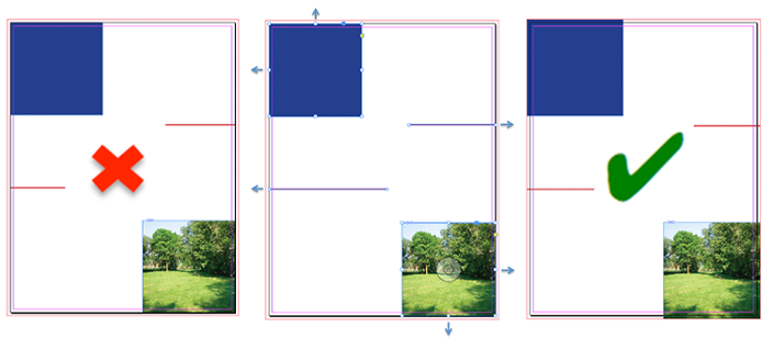
Bleed refers to the extra area of a printed design
that extends beyond the trim edge to ensure there are no white borders when the
material is trimmed to its final size. Including bleed is crucial for designs
that require elements to reach the edge of the paper, such as full-bleed images
or backgrounds. Typically, a bleed of 0.125 inches is sufficient for most print
projects, but for wide format applications like wallpaper or vinyl graphics, a
larger bleed may be necessary to accommodate variations in trimming.
5. SEPARATE LAYERS FOR COATINGS AND SPOT INKS
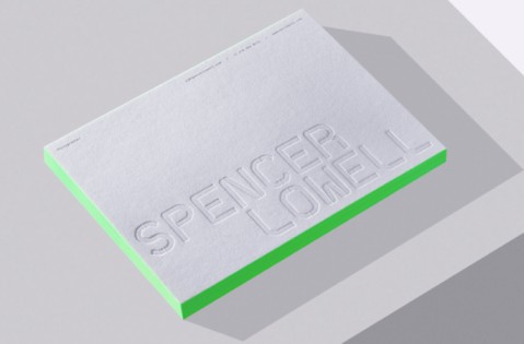
Specialty coatings, such as varnishes or spot UV, and spot inks, such as metallic or fluorescent colors, often require separate layers in the artwork file to indicate where they should be applied. Including these layers with clear labeling helps the printer understand the design’s intended finish and ensures accurate production. Additionally, naming spot colors the same as their respective layers helps streamline the printing process and avoid confusion.
6. WATCH PAGE COUNTS AND CREEP FOR BOOKLETS
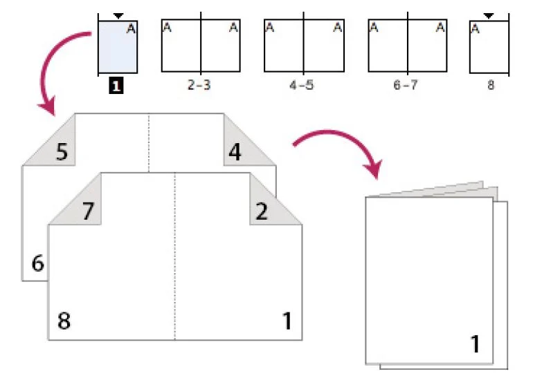
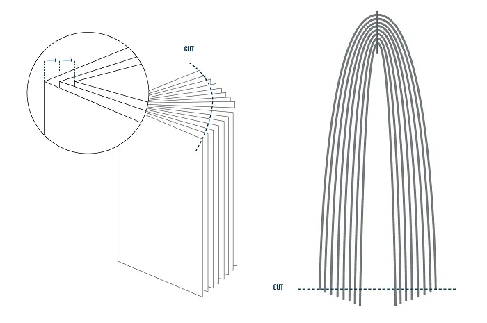
When designing stitched booklets or brochures, it’s important to ensure that the total number of pages is divisible by four, as each sheet of paper will typically contain four pages when folded and bound. Additionally, designers must account for “creep,” which occurs when pages are stacked and folded, causing inner pages to protrude slightly beyond outer pages. To prevent important content from being trimmed off during finishing, create a safe zone within the page margins where critical elements like text or images should be placed.
In short, avoiding these mistakes helps ensure your printing goes smoothly and your materials look great. Pay attention to things like color, picture quality, and bleed areas. Make sure your files are ready for printing and talk to your printer if you need help. Working together will give you the best results for your project.
Recent Posts
PLAIN BLACK or RICH BLACK
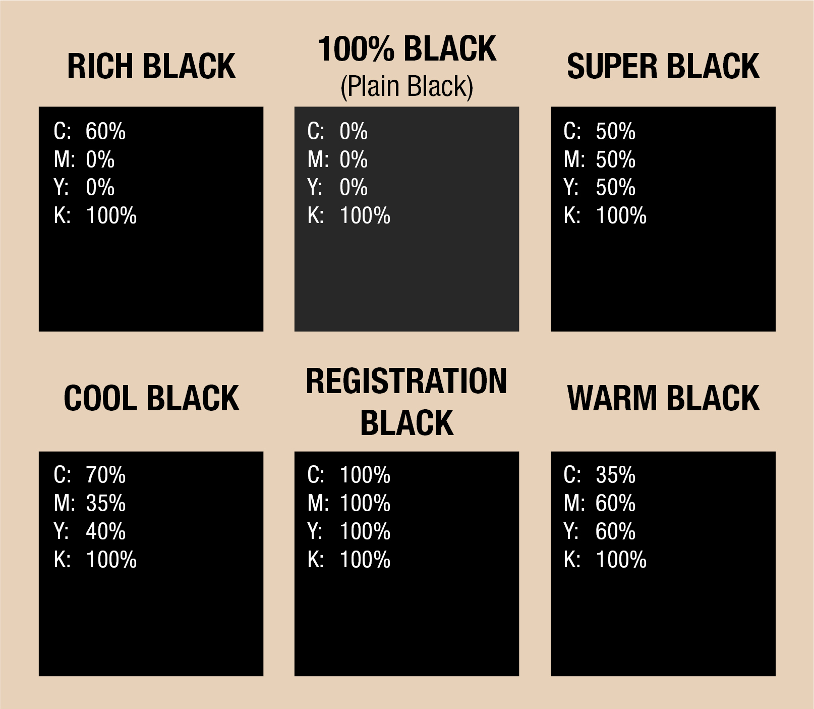
Every colour has different shades, except Black, right? Wrong. Black comes in diffrent shades, including “cool” and “warm” black.
To achieve a “rich, cool black,” you can increase Cyan percentage to 40% while increasing Magenta to 40% will give you a “rich, warm black.”
Although black is an integral component in the four-color process known as CMYK (Cyan, Magenta, Yellow, and Key/Black), you can use black ink on its own. This is where the distinction of Plain Black vs. Rich Black comes into play.
You can also mix other colors to get your desired shade of black.
Confused? Here’s why:
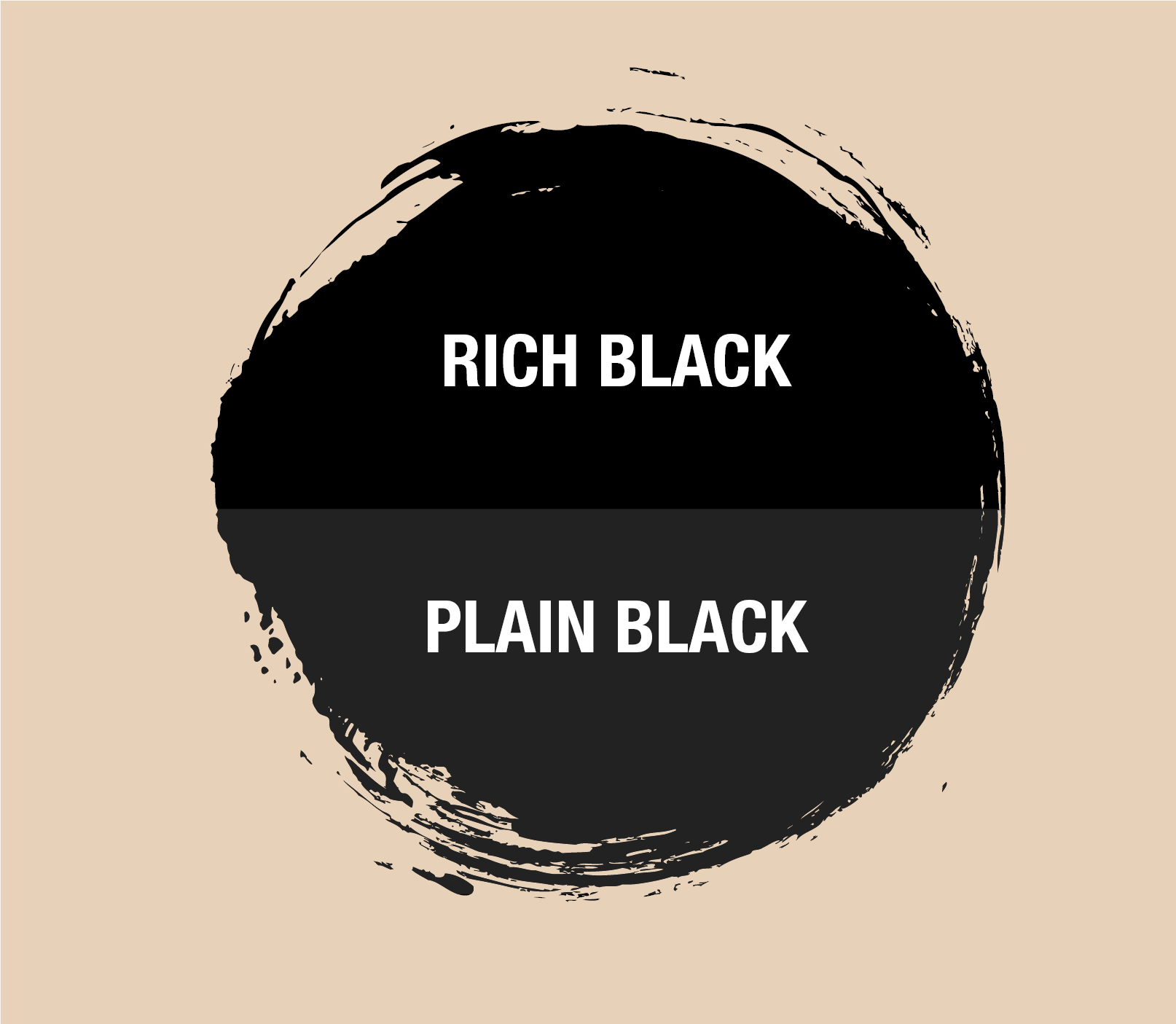
If we print just black ink on a large area, it will look more like a deep grey.
If you were after a good, “dark” black, you would probably ask, “Why is this black not dark enough?”
We need to incorporate other ink colors to achieve a more full-bodied black. The resulting kind of black created from adding other print process colors is called “Rich black.”
The particular shade of black is determined by the per- centage value of each color in the final mix.
This rich black version always appears to be more saturated than if we would just print plain black ink or 100% black.
WHAT IS THE DIFFERENCE BETWEEN RICH BLACK AND PLAIN BLACK?
Unlike prints that use CMYK inks to reproduce colors, our digital monitors use RGB (Red, Green, and Blue) light to show us the colors we see on screen.
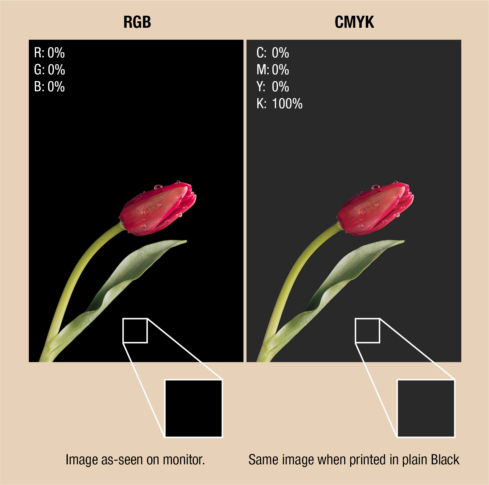
The issue with all of these shades of black is that they all appear the same on a screen (they’re all Red 0, Green 0, Blue 0), but they won’t look the same on paper.
While developing your design, do not forget that Rich black incorporates Cyan, Magenta, Yellow, and Black inks. On the other hand, plain black utilizes just black ink (Cyan 0 – Magenta 0 – Yellow 0 – 100 percent Black or Key).
Rich black will be more well-rounded and will look more saturated since this requires more ink.
The two may appear to be identical on your screen, but on paper, they are not. The difference in print will be similar to what you see here.
Take this scenario: A common error amongst newbies is to insert a rich black image into a picture box and then set the backdrop of the box as black. Always keep in mind that in page layout software, black translates to plain black.
On your computer screen, it can seem uniform and consistent. Nonetheless, if the pattern were to be printed, there would be a clear distinction between the rich black and plain black regions. Take a look below:
Since black always looks, well, black on the screens, rich black and plain black mostly come into play in print design.
Rich black is the superior choice on paper if you want to avoid an unappealing grey shade on your printed packaging. The black that you see in black and white printing is very different from the black in full-color CMYK printing.
HOW TO ACHIEVE ACCURATE BLACK COLOR RESULTS ON YOUR LABELS
What if, looking at your custom labels and custom bags, you might find that the black inked areas look bland, lifeless, and not as saturated as you would have liked.
If that’s your honest opinion, that is because you used 100% Key, with no other colors to make the black look more robust.
One of the most extraordinary things about utilizing rich black for printing ser- vices is that the results can range from sleek to mysterious, even avant-garde. Whichever “colored” black you choose, you get a commanding black hue that is unlikely to fade.
To ensure uniformity, you need to double-check the values for each shade in all of your blacks. Another option to use black ink on labels is to use a PMS Spot Color.
There are dozens of PMS spot colors to select from. When choosing colors, it is best to use a physical color standard guide because the RGB screen color assimilations cannot match the physical Pantone color standards.
Choice of material is also an essential factor because the color of the material can change the ink’s appearance. Think printing on brown Kraft versus plain white paper or printing on metalized silver plastic foil stock.
HOW TO CREATE A TRUE RICH BLACK COLOR
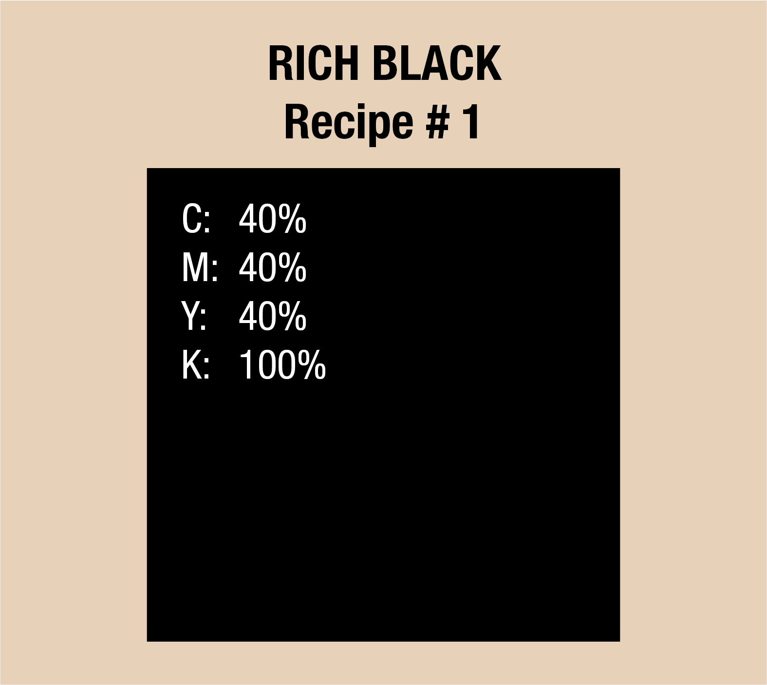
The first formula is Cyan 40 Magenta 40 Yellow 40 blacK 100. Designers may want to leave off the yellow, although it helps balance out the other hues. The change may be imperceptible to the naked eye, and outcomes may vary de- pending on which printing company you choose.
The rich black recipe is an ink combination of plain black (100% K) and one or more CMYK ink colors used in printing services. When compared to printing with only black ink, rich black produces a darker effect.
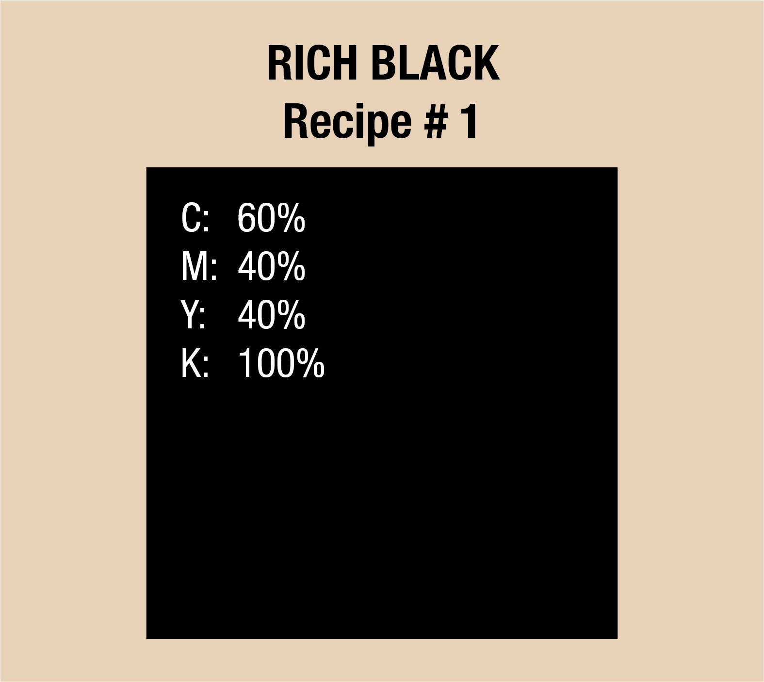
Use all the commercial CMYK process colors Cyan, Magenta, Yellow, and Black to form the rich black composition. Consider utilizing the rich formula C60 M40 Y40 K100 if you want a more neutral rich black hue. The color mixing in this formula is pretty much limited to 240%.
If you wish to tweak the above combinations to your preference, keep in mind that you’ll need to reduce the percentage of one color while increasing the percentage of another.
HOW TO GET PERFECT BLACK COLOR IN PRINTING: SAVE YOUR RECIPES
Experimenting with creating Rich blacks will help you learn how these four CMYK values interact and how to create your custom combination. Since this CMYK color mode has four color variables, there are several approaches to achieve a Rich black.
Although the usual combinations described above may not be appropriate for your project, they are practical examples for achieving a Rich black. Don’t hes- itate to experiment with different CMYK combinations to discover your prefer- ence. Contact print designers to discuss print-approved options.
There is no such thing as the ideal black ink, come to think of it. When these four CMYK colors are mixed, you get the desired outcome: a Rich black, which is a deep, intense shade.

WHEN TO USE RICH BLACK IN PRINTING
If you have a large black region that uses a lot of black ink or has a black back- drop, apply Rich black in significant portions. Pure black is also an excellent, dramatic choice when dealing with posters or other items with text in huge letters.
Rich black is also a good choice when you have a lighter backdrop and want a deeper hue on top to contrast effectively.
A new printer may become confused and combine the standard black with the backdrop, allowing the background to show through. Rich black solves this problem and provides you the rich, deep black you require.
However, while a deep black color does look fantastic, there are occasions when you don’t need to use it in your print project.

HEN TO AVOID USING RICH BLACK IN PRINTING
Not every setting necessitates the use of rich black. Yes, there are instances where too much of a good thing leads to more issues.
FINE DETAIL:
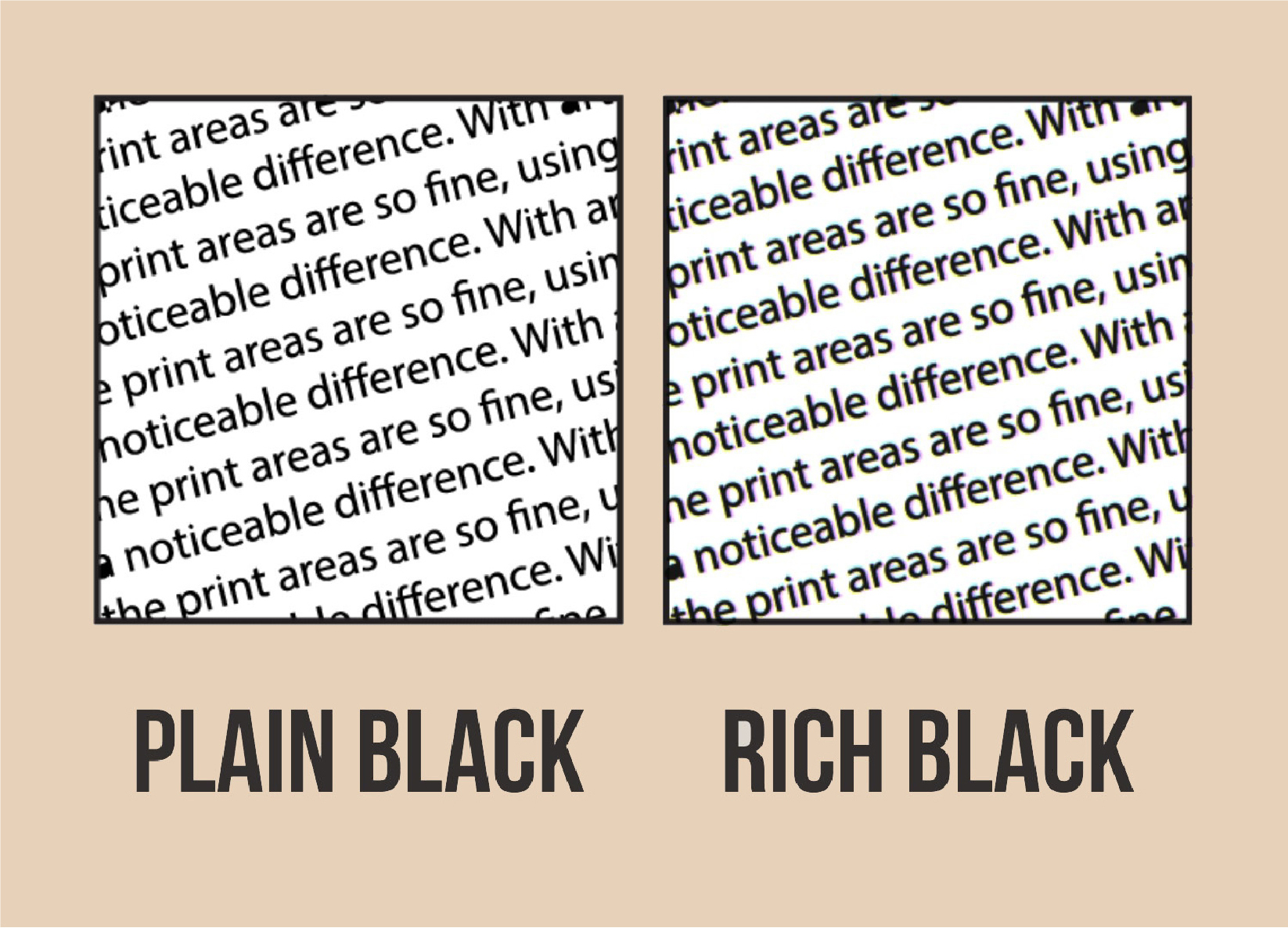
When working with delicate areas, very thin lines, or small type (or fonts with thin terminals), you should apply plain black.
With art elements like these, it’s best to keep it simple. Since the print areas are so fine, using Rich black doesn’t make a noticeable difference.
Even in a full-color CMYK project, you don’t want to utilize deep black for fine detail.
The tiny color shadows that form around these areas of fine detail due to minuscule differences in plate registration between the four colors result from ghosting. This print issue is a common occurrence in newsprint.
CHOICE OF PRINTING MATERIAL:
When using a deep black on a material such as light paper, the ink might bleed and damage the paper’s structure. With lighter stock, sometimes the material isn’t dense enough to hold large volumes of ink.
CHOICE OF PMS OR SPOT COLOR:
You don’t need to add Rich black if you’re just printing Spot Colors for your packaging artwork. On top of the Spot Color print fees, the added fee of using CMYK inks doesn’t justify the ends if you are paying just to create Rich black.
MONOCHROME PRINTS:
Same as the above, paying for running CMYK printing just adds more cost for your print run. Why pay for the 4-color process if you simply need a black on white prints?
THE SECRET TO MAKING BLACK WORK WITH VECTOR SOFTWARE
As mentioned earlier, it’s OK to add other ink colors to black ink to improve its depth and complexity.
KEEPING IT PLAIN.
It’s also best to use plain black ink on small body copy text and fine keyline borders. However, if you have a solid black backdrop or huge black font, the solid black may appear washed out when printed.
MAKING IT RICH.
All process inks use translucent inks. They act as a color filter, allowing light to flow through. The light is then reflected to our eyes, producing a washed-out black appearance.
You will have a problem when you add an image above a rich black region in a page layout, and the picture has a black backdrop. A scanned image’s dark backdrop is unlikely to be 40-40-40-100. It may appear right on your display, but the discrepancy will be visible if it does not match the printed design.
Opening the image in your vector graphics software and checking the color in the info panel is the easiest method you can use to check.
Place your pointer over the dark area. The CMYK values will be in the upper left region of the info menu in a CMYK picture. If your image is RGB, make it CMYK. Another alternative is to match the image’s rich black in the page lay- out application.
-PLAIN BLACK VS RICH BLACK: FAQS-
WHEN SHOULD YOU USE RICH BLACK?
Rich black is a darker black tone that works well for massive, solid blocks of black and may be used to complement picture backdrops. However, rich black is only economically reasonable when you are already using the four-color process.
CAN YOU PRINT RICH BLACK?
There are many CMYK arrangements that the printing industry recommends for printing rich black. After extensive testing and calibration, we have narrowed down to a configuration that best suits our printing presses.
WHAT IS RICH BLACK IN PRINTING?
In printing, rich black is achieved by layering solid black ink over one or more additional CMYK colors, yielding a deeper tone than that of 100% black ink.
WHY IS CMYK BLACK NOT BLACK?
When you use 100% black, you almost never get black; instead, you get dark grey. Because different printers use different substrates and inks, CMYK can only come close to matching what appears on screen vs what appears on paper.
