HOW LOGOS SHAPE OUR MINDS: A GLOBAL PERSPECTIVE
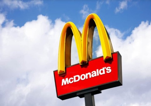
Ever wondered why some colors are so closely tied to famous brands? Take the yellow arches you see almost everywhere – what’s the secret behind their worldwide recognition? It’s all about color psychology.
At OSP, our team has dug deep into the world of logos, examining hundreds of top brands to uncover the most popular colors used in key industries like food, drink, finance, tech, and fashion. We’ve also explored what makes these colors so effective.
In our latest study, we reveal how color influences top brands and the psychology behind these choices. Plus, we chatted with neuromarketing expert Katie Hart, who explains how color affects our buying decisions.
Decoding Color Psychology: Expert Insights from a Neuromarketing Specialist
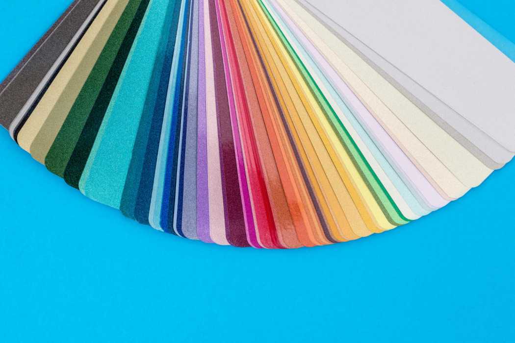
Color psychology examines how different colors impact our emotions and actions. Its effects are evident in everything from building designs to brand logos. By understanding color psychology, we can better communicate and influence others through our choices in color.
Katie Hart explains, “Neuroscience has revealed that color impacts us on a subconscious level, meaning we often aren’t fully aware of its influence.”
She continues, “Different light wavelengths send strong messages to our brains that we can’t control. This is the essence of color’s power.”
Hart also shared how color psychology affects our buying choices. According to her, brand logo colors influence our decisions in three ways:
1. Through our subconscious mind
2. Via color psychology
3. From our evolutionary history
Why do so many of our favorite fast-food chains use red in their branding?
Did you know that red can boost our energy and motivate us to take action, while blue can calm us and even lower our heart rate?
If you’re designing a brand logo or thinking about updating your current one, using this crucial information and expert insights can help you truly express your brand’s personality.
4. What impression do you want to make?
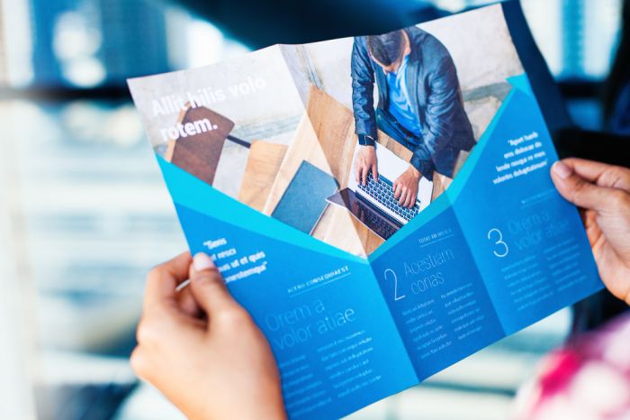
Consider the impression you want to create. What feelings or perceptions should your brochure evoke? For instance, a luxury resort brochure would use elegant design elements, while a brochure for gutter cleaning might focus on practicality. Align the design and quality with the brochure’s purpose for maximum impact.
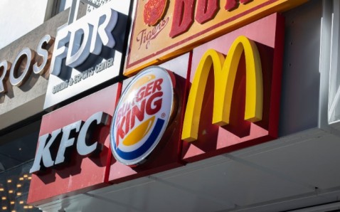
Red and pink dominate the food and drink industries.
Red is the dominant color in the food and drink industries, covering 41% of food branding and 29% of drink branding.
Katie Hart explains, “Colors with longer wavelengths, like red, stimulate and excite us. They can increase appetite, heart rate, and even blood pressure, making us more impulsive and likely to eat more.”
It’s clear why red is so popular among fast food chains—it taps into these psychological effects to boost appetite and drive action.
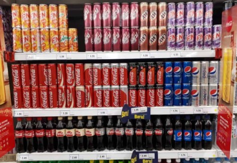
Blue is a prominent color in top-performing brand logos worldwide, appearing in 27% of food industry logos and 24% of drink industry logos.
On the other hand, purple is the least effective color in both industries, so it’s best to avoid it for your food or drink brand logo.
Despite the rise in eco-friendly initiatives, green hasn’t become a dominant color in these sectors, averaging only 12.5% across both food and drink industries.
Why is finance "blue in the face"?
Our research shows that blue is the top choice for brand logos in the finance industry, with 31% of companies using blue. This surpasses red, which is used by 28% of finance brands.
In a high-pressure field like finance, it might be a good thing that red isn’t the dominant color, potentially helping to keep stress levels in check.
Katie Hart explains, “Shorter wavelength colors, like blue, have the opposite effect of red. They help calm us, reduce impulsiveness, and lower our heart rate.
“This sense of security, stability, and reliability might be why blue is so effective in the tech and finance sectors. Historically, blue hues were linked to water and clear skies, which were associated with safety and well-being.”
What makes the tech industry “black and blue”?
With a combined value of about $5.2 trillion in 2021, the tech sector is thriving. Blue and black are dominant in the industry, appearing in 53% of top-performing brand logos.
Blue is especially popular among social media platforms, with Facebook, LinkedIn, Twitter, Skype, and Telegram all featuring this color. It’s used by 30% of the leading tech companies.
Katie Hart notes, “Interestingly, blue is now linked with communication, likely due to its associations with security and safety.
“For instance, Google adjusted the shade of blue used for its search links to a more ‘reddish’ blue. Did you notice the change? Most people didn’t, but Google attributes this subtle shift to an extra $200 million in annual advertising revenue. Amazing how such a small change can make such a big impact!”
Black dominates 44% of logos in the fashion industry
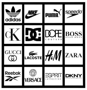
From high-end couture to budget-friendly fashion, black is a staple. Iconic brands like Calvin Klein, Dior, and Boss showcase black, while more affordable names like Next, New Look, and River Island also embrace the color.
On the high street, black remains a dominant choice, featuring in 44% of the top-performing fashion brand logos worldwide.
Katie Hart explains, “Black conveys strength, dominance, power, and mystery—all qualities that are appealing for high-value brands.
“But it’s also about context. For a fashion brand, black offers the flexibility to complement any seasonal color trends, making it a strategic choice for long-term success in the industry.”
Blue: The Most Successful Brand Logo Color of All Time
Our study revealed that 31% of the top-performing brands of all time feature blue in their logos. Blue is a popular choice across various industries, including food, drink, finance, tech, and fashion.
Red also ranks high among successful logos. Together, blue and red account for 55% of the leading brand logos we encounter daily.
The colors featured in the logos of the most successful brands of all time:
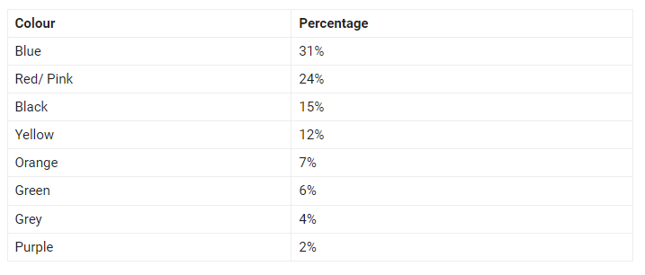
It’s fascinating that the two most successful colors evoke such different responses. Blue has a calming effect, reducing our heart rate, while red stimulates action, increasing both heart rate and blood pressure.
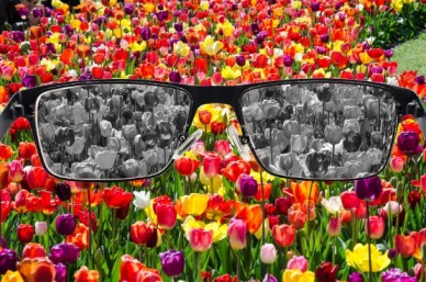
Katie Hart added, “As we become more aware of how color affects our moods and behaviors, we can better understand why brands using these colors succeed.
“Reds, oranges, and yellows have long been used to grab attention and stand out, just like road signs around the world.
“So, when creating a brand, it’s natural to choose colors that make you stand out and set you apart from the competition. These colors are often associated with boldness, youthfulness, and a touch of disruption.”
Our Subconscious Mind
Katie Hart explained, “We process vast amounts of sensory information, but only a fraction reaches our conscious awareness. Colors that naturally capture our subconscious attention are more likely to stand out.
“Consumers may believe they’re choosing based on their conscious color preferences, but many underlying factors influence their decisions without them realizing it.”
Many brands use color psychology to shape perceptions and boost sales.
Katie Hart said, “Brands that align their colors with the emotional states they want to evoke effectively harness the power of color perception.
“Color perception can alter our physiological state, mood, and likelihood to take action, thereby influencing our purchasing decisions.”
Colour psychology and our evolutionary past
Katie Hart said, “Different color wavelengths are detected by various parts of our retina, sending distinct messages to the brain.
“These messages trigger automatic physiological responses, which may have had evolutionary survival benefits and still influence our actions today.”
Revealing Your True Colors
Color affects us in ways we can’t fully control, as our subconscious mind processes light in mysterious ways.
Consider the brands you often buy from: do they make your heart race to spur action, or do they create a calm environment to reduce impulsive buying?
If you’re ready to use this insight to create a standout brand, trust OSP to turn your vision into a printed masterpiece!
[Bulk Printing, Offset Printing, Commercial Printing, Printing Partner, Printing Service Provider, Printing Solutions, Printers For Corporates, Professional Printing, One Step Print LLP, Offset printer for bulk Printing, Printer Nearby, Color Psychology in Printing, Brand Logo Colors, Logo Printing, Printing and Color Impact, Printing Strategies, Color in Marketing Materials, Effective Printing Colors, Color Wavelengths in Printing, Printed Branding Solutions, Color Perception in Print, Psychological Effects of Print Colors, High-Performance Brand Printing, Printing Industry Trends, Subconscious Influence of Print Colors, Color Choices for Print Media]
