WHY CHEAP PRINTING ISN'T WORTH IT!
In today’s world, there are countless cheap printing options available. However, cheap often means poor quality, unprofessional results, and little to no return on investment (ROI).
Consumers understand that their print and digital materials are investments in their business. To make a great first impression and see a good ROI, you need to invest wisely. This doesn’t mean going straight for the most expensive option, but it does mean remembering that you get what you pay for.
Many print buyers try to negotiate the lowest price, which can work in some industries. However, in printing, a lower price often means lower quality. Suppliers must cut corners to meet budget demands, resulting in a compromised final product.
When planning your print budget, keep these key points in mind to ensure you get a great product that yields a good ROI.
1. Quality
The quality of the paper and ink used can make the difference between an unprofessional, novice-looking product and a polished, professional one. People appreciate tangible items that appeal to multiple senses. A sleek, high-quality product not only looks better but also feels better to touch, boosting your credibility and converting into more business. Special finishes like matte lamination or spot UV enhance the tactile experience, while thicker paper stocks always add value and help you make a lasting impression.
2. Design
Never underestimate the power of professionally – designed print material. A cheap print design can make your product look unimpressive and fail to grab your prospective customer’s attention. A well-crafted design, on the other hand, draws customers in, making them want to pick up your leaflets or flyers and learn more.
There are many innovative ways to make your designs stand out. Simple options like QR codes can link directly to a URL, while augmented reality designs using smartphone apps can provide extra product information, giving you a competitive edge. However, be cautious with technology – only use it if it suits your market.
Sometimes, less is more. If you have a small flyer and a straightforward offer, like “FREE fries with every burger – today only!”, the headline says it all. You don’t need to over-explain. A few location details and a good image can seal the deal. The reader makes an instant decision based on the headline, influenced by the look and feel of the flyer. If it feels cheap, they might assume your burger is cheap too—and no one wants a cheap burger!
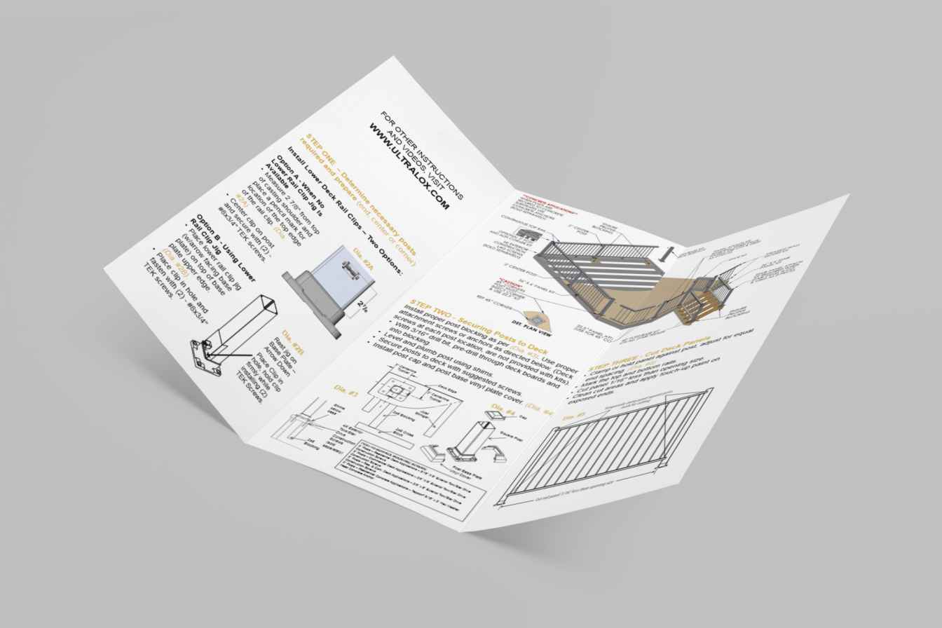
For sophisticated or high-value offers, the reader may need time to consider all the details. In such cases, a multi-page brochure might be necessary. Don’t skimp on print quality here, or your marketing could end up in the recycling bin.
3. Images
“Images speak a thousand words” – it’s a cliché, but it’s true. To engage your audience, ensure your images are visually appealing and embody the message you want to convey. A good image brings your print to life and makes it memorable.
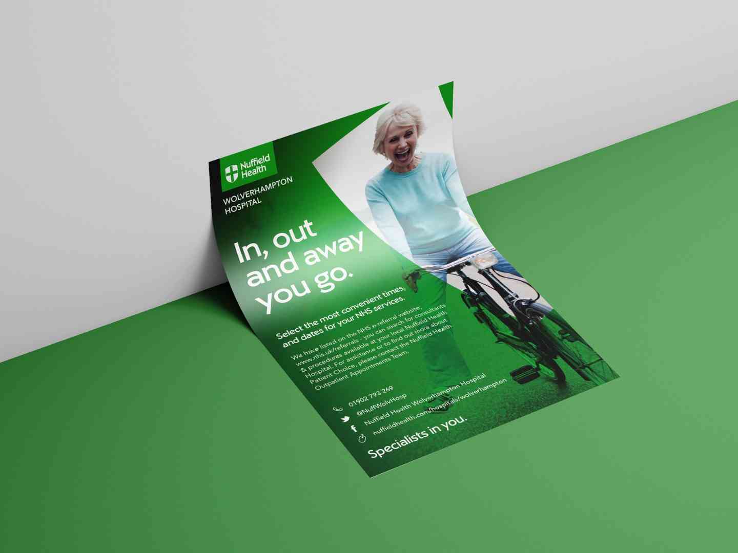
Work your images around your text. Use Photoshop to adjust and blend sections, ensuring your text is fully legible. For instance, we recently saw an appointment card with a background of dark green grass and black text over it, making the card unreadable and unprofessional – especially since the illegible text was the phone number.
Text-only designs are often best for direct marketing, where you want the reader to focus on your message without visual distractions. Powerful, motivating copy can draw readers in.
Of course, there are exceptions. If you have access to a brilliantly creative designer who can make text look amazing with fonts and color, you’re luckier than most. There’s no substitute for a professional designer to elevate your artwork. Combining a good layout, compelling images, and high-quality paper stock will showcase your pictures beautifully and provide the best overall solution.
4. Colour
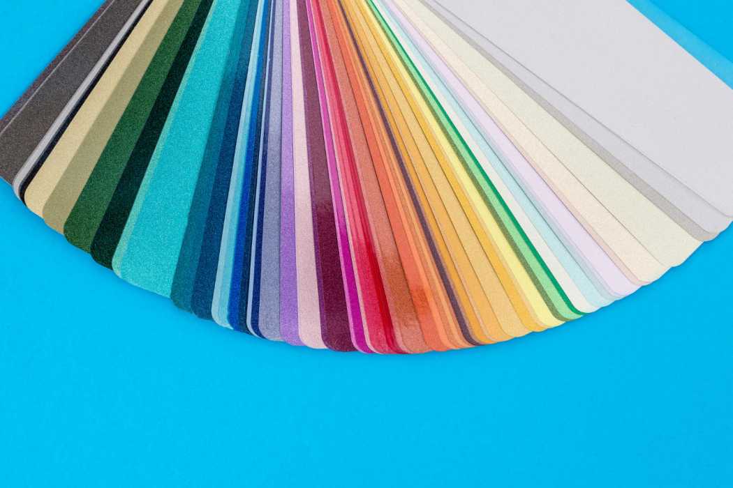
Promotional print material with only black and white text and images can look dated and cheap. Gone are the days of photocopying and home printing—print has evolved. Digital, full-color printing is now affordable, so don’t cut corners!
Using color printing for your marketing is essential. If you don’t want your advert, brochure, or leaflet to end up in the trash, avoid low-quality, single-color artwork. Think carefully and invest in high-quality, colorful designs to make a lasting impression.
5. Copy
Nothing is more important than the words you write – except for how you spell them!
Poor copy, spelling mistakes, and bad grammar will immediately turn off your reader. If you’re responsible for writing your marketing text, have your colleagues proofread it. Re-read and tweak it as necessary.
If you’re not a copywriter and many of us aren’t – hire a professional. Even award-winning design can’t overcome weak copy. Make every word count.
6. Make sure you can measure
No matter the cost of your print campaign, make it measurable. Tracking your campaigns allows you to refine and improve future efforts. Include a code for customers to quote or a trackable link. Dedicated freephone numbers are also effective and can be linked to direct sales. By making your campaigns measurable, you gain valuable insights for optimizing your marketing strategies in the future.
Choosing cheap printing for your next ad might waste your money. Don’t let people think you’re being cheap! Spend on good design and good printing to build your brand.
[Bulk Printing, Offset Printing, Commercial Printing, Printing Partner, Printing Service Provider, Printing Solutions, Printers For Corporates, Professional Printing, One Step Print LLP, Offset printer for bulk Printing, Printer Nearby, Cheap printing, marketing budget, brand image, quality print, design investment, positive impact, cost-effective marketing, professional appearance, brand perception, return on investment (ROI)]
